
Boukuet is a florist shop app that sells flowers, pot plants and flower/plant-related supplies. Its main aim is to provide frustration-free and pleasant discovering and shopping to all customers on different knowledge and experience levels.
Project duration: September—November 2022
My responsibilities: Conducting user research, refining user problems, ideating, wireframing, low- and high-fidelity prototyping, conducting usability studies and iterating on designs.
Emphasize & Define
To gain better understandings of users’ needs and pain points, I conducted interviews to ask users about their experience in visiting physical florist shops.
Despite having different experiences and interests, all interviewees need flexible and streamlined ways to purchase items. Some users indicated that price could play an important role in their decision-making. Such information agreed with and reinforced the initial design plans.
On the other hand, it was also revealed in the interviews that even experienced users sometimes need tips and new ideas. This observation has led to a conclusion that an informative and active blog section would be more useful to all users than a static knowledge base that was initially planned to help inexperienced users.
I summarized the following pain points:
- Discoverability
When there are a lot of items presented, it is difficult to find the ones that meet the user’s need. - Background information
Users are often unsure if certain flowers would be suitable for the occasions they are shopping for. - Time
Users with full-time jobs cannot always find time to visit florist shops. Some users also need their delivery on some certain days.
Based on the pain points, I created two personas, Christina and Tumaini, with their corresponding problem statements:
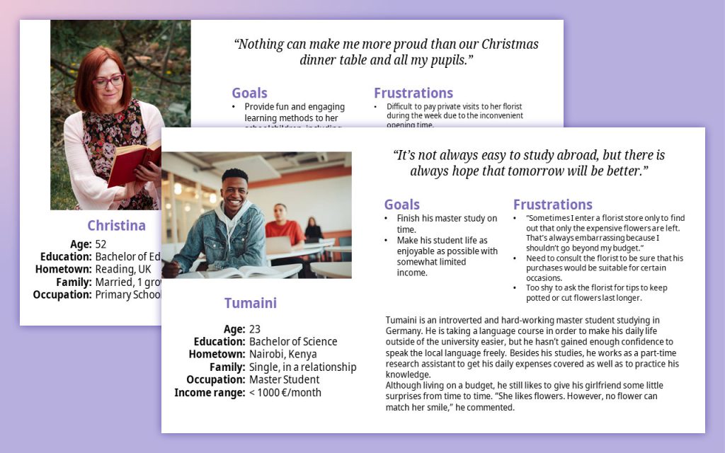
Christina is a busy primary school teacher who needs quick and easy methods to find specific items because she wants to get the home decorations that fits her style fast.
Tumaini is a price-sensitive master student who needs recommendations and tips when buying flowers, because he wants to be sure that his purchase suits the occasion despite his limited knowledge in flowers.
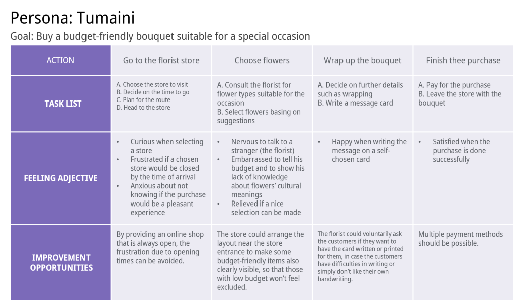
After the creation of personas and problem statements, I mapped user journey maps to reveal points that need attention during the design.
Ideate
In the ideation phase, I used two main methods: storyboards and competitive audit.
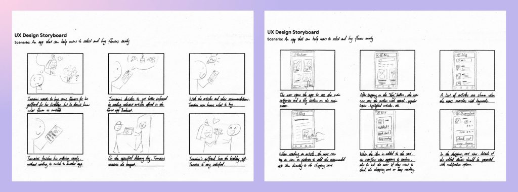
Other than drafting user scenarios with storyboards, I also investigated 5 different competitors. The audit can be viewed in the Microsoft Excel spreadsheet here. The competitive audit results not only provided me with inspirations, but also resulted in an interesting change I made when prototyping.
Prototype & Test
The prototyping phase and testing phase are closely intertwined in this project. Two rounds of usability studies are conducted before finishing the low-fidelity prototype and the high-fidelity prototype. Therefore, the pipeline is:
Create wireframes → Create low-fidelity prototype → Usability study → Update prototype → Create mockups → Create high-fidelity prototype → Usability study → Update prototype
Wireframes
Each screen’s design was first drafted with wireframes on paper. For each screen, I drafted 5 different designs, selected good components and ideas from these drafts, and combined them to make one refined design.
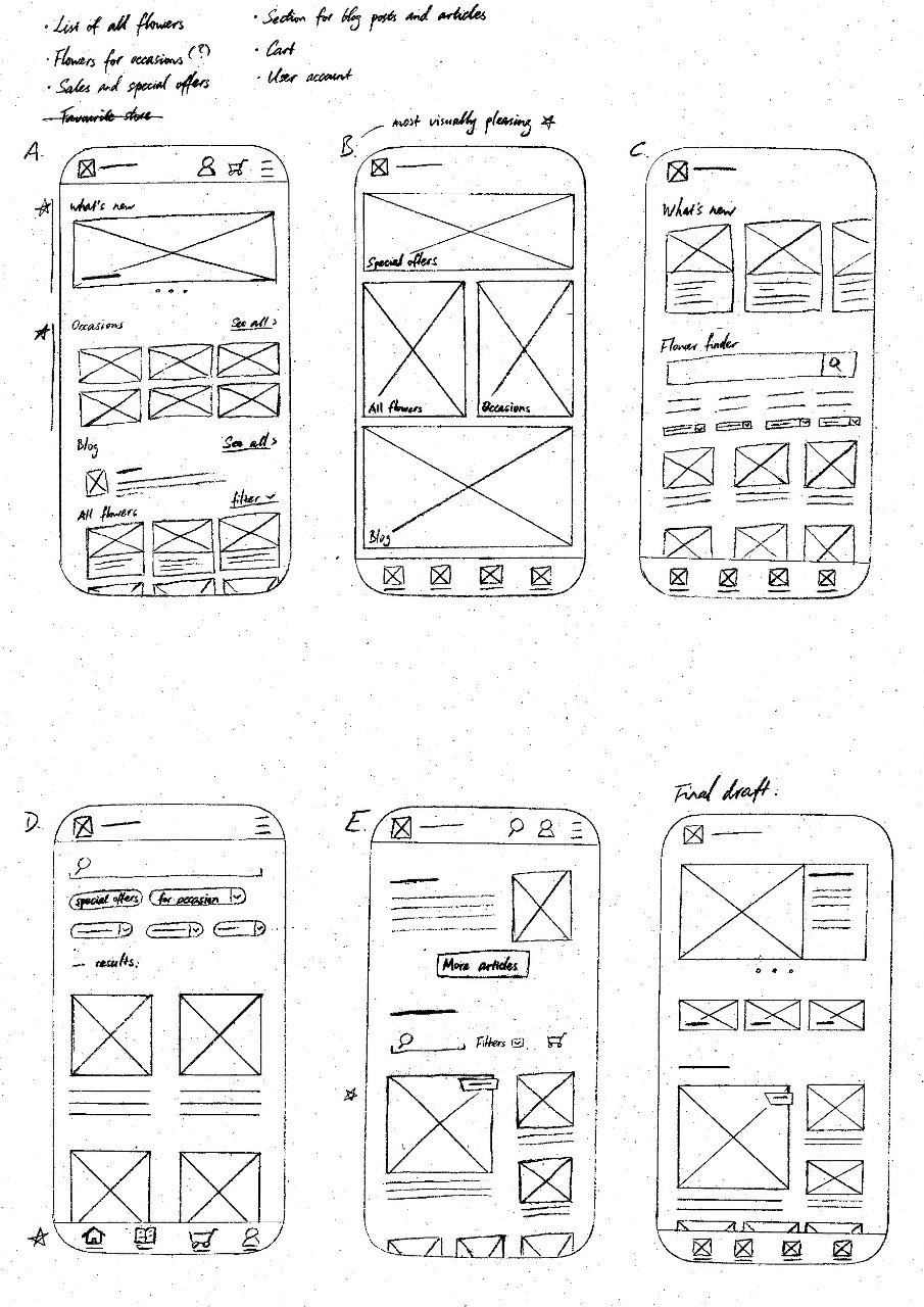
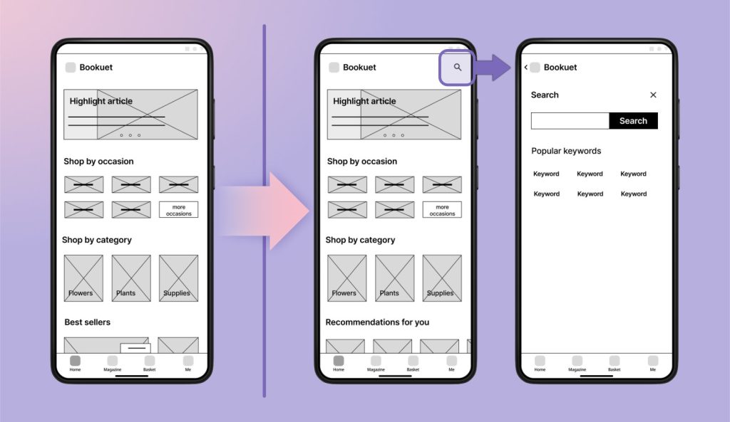
When transforming paper wireframes into digital ones in Figma, I revisited the competitors I investigated, and noticed that most of them have no search function. I supposed that it might be a deliberate decision given that many users might not necessarily know the precise names of flowers or flower arrangements, and filters should be a more sufficient way for item discovery in this sense. I decided to follow this and leave the search box out—a decision that will be revisited later.
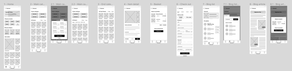
Low-fidelity prototype and the first usability study
The first version of the low-fidelity prototype was made based on the wireframes, and was put into the first round of usability study.
I arranged a round of moderated usability research with 8 participants in late October 2022. A few key information of the study is listed below:
- Participants: 4 females and 4 males / 19 to 55 years old / reside in China, Germany and Switzerland
- Duration and location: ~20 minutes per participant, remote
- KPIs: Time on task, drop-off rates, user error rates, system usability scale
After the reviews, I created an affinity diagram to categorise and prioritise the feedback. Below shows an excerpt of the sorted affinity diagram, each post-it colour representing one participant:
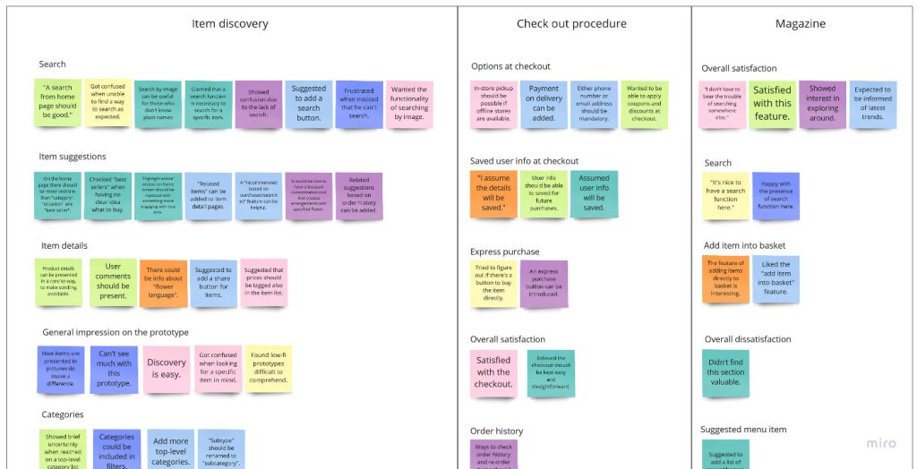
From the results, three main action points are concluded:
- Search feature with an easy-to-access search button should be added.
- An advanced recommendation feature will increase users’ satisfaction.
- During checkout, an option should be provided to remember the information the user has entered.
The first point is specially surprising, because the search function, which is not available at most online florist services, was requested by almost all (7 out of 8, to be precise) participants. Nevertheless, it should be the users’ voice that counts, not how competitors include or exclude a function.
The prototype was updated according to all the action points, and was ready to be transformed into a high-fidelity one.
Accessible considerations
When creating the concrete visual style of the app, my first choice for the primary colour of the app was #988ECA. However, I found out later that this colour and white has a contrast ratio below 3:1, too low to meet the WCAG (Web Content Accessibility Guidelines) AA level. I therefore darkened it to #7B6AB9, a colour that is more accessible. A notable increase in readability of many tags and buttons were observed after the change.
Besides, some elements seen in the low-fidelity prototype were tweaked to ensure that the minimal margin between any touchable elements is no less than 16 px, while buttons for different action types are at least 24 px apart. This creates a more touch-friendly interface.
Design kit
As the making of high-fidelity mockups continued, a design kit containing reusable components was formed. By keeping all the components together, it became much easier to modify all the instances across multiple screens easily. Here is a glimpse of it:
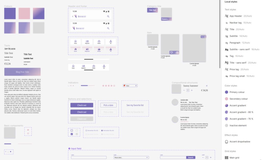
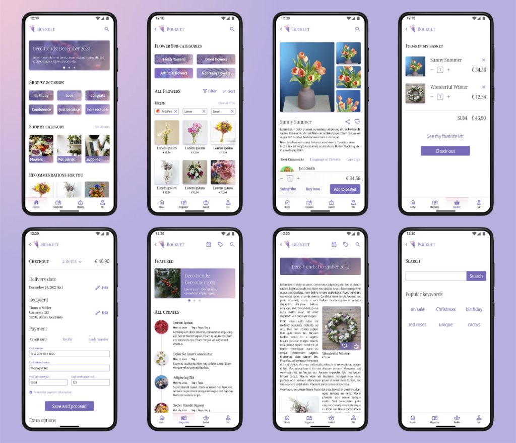
With the help of this kit, all the mockups are created. Here are a few examples:
High-fidelity prototype and the second usability study
After all the mockups were created and connected to form a prototype, I conducted the second round of usability study in late November 2022 to check if the design could meet users’ needs well enough. It is very similar to the first round, with the following differences:
- Participants: 3 females and 2 males / 29 to 40 years old / reside in Germany and the USA
- Duration: ~15 minutes per participant
- Methodology: Unmoderated study
The key findings are:
- Participants showed high level of satisfactory in general.
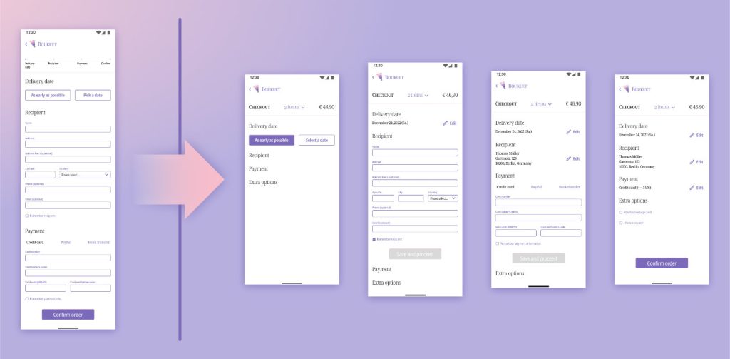
- An overview of order information on the checkout page could be beneficial.
To address the second point, I reconstructed the checkout screen:
After a few final minor polishing-ups, the prototype is finished and ready for delivery.
Impact & Conclusions
This product was well-conceived by the study participants. They praised its visual design and ease to be used. One participant even gave suggestions on how to find commercial partners, thinking this design was to be made into a real product. Another participant commented, “I would see myself spending some hours on this app when I got nothing to do, just to check around.”
By designing this product in a systematic manner, I practiced a lot of skills, ranging from “crazy eights” for ideation to the creation of a design system. Among everything I learned, I value these two the most:
- User study with an early prototype is extremely important, as it can already reveal overlooked users’ needs and design flaws.
- The idea of object-oriented programming applies to prototyping, too. Make a set of components early on.
Going forward, I believe the following topics would be ideal for the next iteration:
- User profile
Features related to the user profile could be added, as test users have already shown great interest in this section and related features (like favourite list). - Dark mode
Some users have pointed out that introducing dark mode to the app would further improve the usability. - Language options
Multilingual designs can not only expand the product’s target audience, but also gather valuable new perspectives for the design itself. - Prototype optimisation
Due to the implementation of the prototype’s screens, some “back” actions are not precisely behaving as we would expect. For example, when trying to go back midway at the checkout, instead of going back to the previous screen, it goes back to the previously section of checkout (which actually is the previous screen in the prototype). Such small issues need to be fixed to provide a more realistic experience.
All the figma resources, including low- and high-fidelity prototypes and the design kit, can be found here.
Many thanks to all the artists who uploaded their work to unsplash.com and blush.design. I wouldn’t have finished my product easily without the stunning stock pictures and illustrations.